Email best practices
Create your email signature in four easy steps
Email signatures are like the business cards of emails. But what exactly do you need to include? How far is too far? We’ll explain everything you need to know.

PUBLISHED ON
We know you send and receive a lot of emails. But how are you signing those emails? Do you give your first and last names and a cheery farewell?
If this is you, you’re missing out on an opportunity to brand yourself and show your contacts a bit of your personality. A title and company name are bare-bones compared to what you could be doing with your email signature.
It’s as unique as you, so here are a few tips to make yours shine.
Table of contents
First and last name
Where you work
Contact information
Social media links
Pronouns
Booking links
Disclaimer
Taglines
Photo or logo
Call-to-action
Highlight what’s important
Keep flair to a minimum
Make it mobile-friendly
Use the design space
What is the purpose of email signatures?
You use an email signature to standardize your closing greeting in all email messages, whether they’re professional or personal. Plus, your email signature populates automatically, so it will show your email recipient who you are regardless of whether you type your name to sign off.
Think of a professional email signature as a digital business card. Instead of forcing someone to add another scrap of paper (you know who you are) to their already bulging pockets, you’re giving them everything they need to know in a handy digital space. Your email clients can discover more about you without searching through their junk drawer to find your information.
A great email signature with cohesive branding presents your organization as well-established, professional, and intentional. If you work for a large organization, your email signature will align with its brand, culture, and voice to show consistency across all departments and employees.
But be careful, it’s easy to go overboard with flair. To help combat going overboard, we’ve compiled a few tips and tricks to help you create your own professional email signature.
10 essential email signature items
Making an impactful email signature requires patience, research, and time. It’s more than a name and a title. It’s a chunk of who you are and a way to show a bit of yourself to the world. A signature template might include all of the following items or just a few, depending on what you want. However, there are a few items that your email signature design must include to make an impact.
Let’s take a look at these items and some email signature examples.
First and last name
Your name is the most crucial part of your email signature. Without this, you are a nameless, formless entity at your organization. Do you even exist with a name in your email signature? You can also include any titles or distinctions you might have, like your doctorate or degree.
Where you work
Now people know what to call you, but where do you work? Include your title, department, and organization in your sign-off to let your email clients know who’s emailing them and give your recipients insight into why you’re contacting them. You garner more credibility when you showcase your job title and organization. It’s a seal of approval and can help gain the attention of your clients.
Contact information
Although this article is about perfecting the email signature, some clients simply don’t want to communicate via email. This makes secondary information essential. Your contact info is how people connect with you. Emphasize any communication line you’re comfortable with revealing – phone number, LinkedIn, or Whatsapp.
Social media links
Linking your social media is a simple way for your email clients to learn more about you, your brand, or your organization. Your online presence is often as significant as your real presence because it shows people what you care about and how you engage with the world. It’s also an opportunity to see if your email client and you have any mutual followers that might sway their inclination to follow you, too.
Remember that any social media you include should be relevant, appropriate, and engaging. If this is a business email signature, you might want to forgo your TikTok account if it doesn’t align with the company’s values.
So how do you link your social media? One of the most engaging ways uses icons – you’ve seen those little birds and polaroid icons. They’re recognizable icons and encourage clicks from your readers. Every social media company – YouTube, Kickstarter, Twitter, Instagram, Facebook, you name it – has an identifiable logo that you can include in your email signature to link to your profile. These brief, bright visuals stand out since most of an email signature is written.
Example
In this clean example from Canva, Karen adds many social media links but not much else. This is a minimalist design, and it works for her career. Other careers would do well to include a phone number, but Karen likely has ways to contact her through her social media.

Pronouns
While pronouns are not always included on email signatures, preferred pronouns have increased in spaces like Instagram, LinkedIn, and Zoom. Pronouns help clarify your identity to email clients if your name is ambiguous and help nonbinary people feel like they are in a safe space.
Booking links
Part of your email signature can include a way to connect outside of email. Instead of going back and forth deciding on a date and time, insert a link to your calendar in your email signature. You can use a few different time saving tools like Calendly or Appointlet. Calendly has a free basic subscription and pairs with your Google and Office 365 calendar.
Disclaimer
This is where your industry standards come in. Your colleagues and superiors might have a specific way they’d like you to write your email signature. The worlds of law, finance, and insurance all come with legal requirements and etiquette due to the exchange of highly sensitive information. Providing your industry’s standards upfront will help protect you and your company. A little research into your industry’s rules and regulations will help protect you and your coworkers.
Taglines
A tagline is a recognizable motto or phrase associated with your brand to express the mission and values in one catchy quip. If your business or personal brand has a tagline, feel free to include it in your signature block.
Photo or logo
Adding a photo or company logo gives your email signature even more authenticity. Clients you’ve never met will easily identify you when you have a meeting. Always use a professional headshot, but not that picture from your sister’s wedding – you know the one. If you’re not comfortable using a photo, you can add your company’s logo for a branded email signature.
Example
In this example, Sarah opts to put her company’s logo rather than her picture. She weaves the same theme throughout for brand recognition. The bold color appeals to the eye, and the attractive design is easy to remember.

Call-to-action
A call-to-action (CTA) is a way to engage your email clients even further. You could link to your company’s website, YouTube channel, or upcoming event. But avoid making it sound like a sales pitch. You’re trying to engage your clients but not oversell them. Match your signature’s style but remember to align with your company’s goals.
Example
In this example, Charlotte provides a CTA using a link to her song on YouTube. She ties her signature directly to what she does. If you were hiring a musician, you would want to hear their music. A CTA is the perfect opportunity to showcase your work.

4 tips and examples for creating an email signature
Now that you know what to include, it’s time to craft your professional email signature. Email signature templates can help inspire format and design if you’re not yet comfortable preparing your own. It might seem daunting to include all that information into a tiny blurb at the end of an email, but a few ways are available to make yours look current, cordial, and complimentary.
Highlight what’s important
This might seem obvious, but your first and last names will always be the most critical piece of your signature. Your affiliations – your school, company and business – should be next. These connections carry a certain gravitas that your name might not have.
Your secondary contact information should follow your name and affiliations. Providing a line to your company phone number is wise, but avoid providing your personal phone number (hello, 3 AM phone calls) unless necessary. If you have international clients, include your country’s international phone number prefix. For a small business or personal brand, add your personal website or portfolio to show your clients your capabilities. You need to put what’s important to you because you are telling your email clients a little piece of your story.
Example
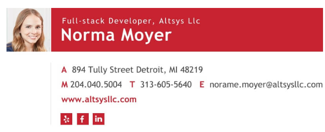
In this example, the name is the largest part of the design. The item hierarchy follows from there, with the colors matching throughout. The eye is drawn to the white writing on a bright color. The reverse is also effective using a dark color on a light background.
Keep flair to a minimum
If you’re into flair – wild colors, wacky emojis, multiple fonts – power to you, but most people will find the signature too busy. Your branding will look better if you use colors sparingly and keep the different fonts to a minimum. One rule of thumb is that sans-serif fonts like Arial or Verdana have the most readability. Your signature should match your company’s theme, so follow suit if they have a font they use for their brand. If you can match your social media icons to your theme, even better. Emojis are fun, but they might seem tacky, especially if you have a picture, a logo, and social media icons. There is a delicate balance between fun and faulty.
Example
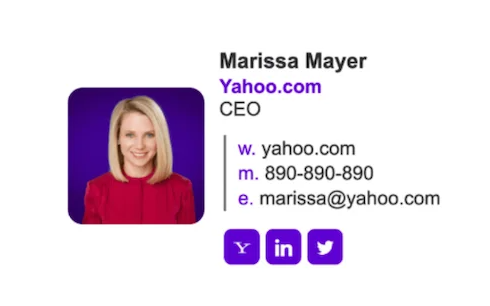
In this example, you can see that Marissa matches Yahoo’s signature color. Everything aligns with Yahoo’s theme, from her photo background to her social media icons, and she uses one font throughout.
Make it mobile-friendly
Think of your first activities in the morning. You make yourself a coffee, eat breakfast, brush your teeth, then what? You probably grab your phone and check your emails. If someone is looking at your email on their phone, you want to ensure your signature is visible and optimized for the small screen. Make your font large enough to see on a mobile screen and your social media icons clickable. Some mobile formatting squishes signatures, so test yours before you unveil it.
Example
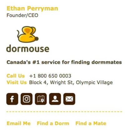
This example is narrow enough to fit on a smartphone screen but still includes applicable information. The company logo is apparent, and the social media icons are spaced evenly so the user can click on each link separately.
Use the design space
An attractive email signature is as easy as using the space provided. The human eye follows design logically, so your most important information should be the largest, with everything else relatively the same size. This gives your email clients the most pertinent information first. You want a clear distinction between your essential information, your social media links, and your picture. Good design uses white space – you can still fit everything you want while still looking sharp.
Example
This example is clean, with a clear separation between the person, her contact information, and her social links. It’s minimalist, but it shows that Anna has a keen eye for her career, graphic design.

Wrapping up
You now have the tools and skills to create a unique email signature to inform your email clients.
Whether through Gmail or Outlook, use your signature to engage your clients, you don’t have to include everything on this list, it’s up to you to find your balance.
Including everything in this small space might seem daunting, but avoiding these common mistakes ensures your new email signature shines. Take care with your flair, and start crafting your own signature today.


