Email Best Practices
Power-up your transactional emails with these 3 tips
Transactional emails are an often overlooked marketing channel that can drive traffic, boost results and increase your user engagement.

PUBLISHED ON
Transactional emails are an often overlooked marketing channel that can drive traffic, boost results and increase your user engagement. When used right they are a powerful tool that any marketer should know how to master.
So what are transactional emails exactly? The term can be a bit misleading since they’re not really about transactions. Instead, transactional emails take many forms: they’re automated emails triggered from an interaction with an online company or product. Most commonly seen examples include password reset emails, account activation emails, and flight booking confirmations.
But these emails listed above often only serve one purpose: to provide the user with the information he or she has requested. A new password, an account activation link, a boarding pass. Which is a shame because transactional emails can be used for much more than that. They can be leveraged and optimized to function as an even more powerful channel to support your marketing efforts. How you ask?
Here are three ways to make more out of your transactional emails:
1.Design them right
Transactional emails are a great medium for leaving an impression on your users. Think of them as a communication channel that needs to reflect your brand and the value you offer. A great way to do that is to design your emails to correspond with your brand identity. Rather than going with a simple, text only layout, consider teaming up with your designer to create a visually appealing template. Your company website probably isn’t just plain text, so why should your emails be? Spice up your email layout with visuals and make your messaging more powerful. Think of every email you send as an opportunity to share your brand identity with your users. Add images, logos and colors to your email that complement your overall visual identity.
Examples
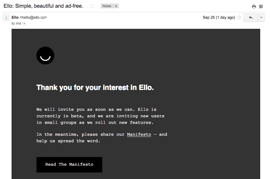
Ello keeps their email design simple and makes use of the same design elements - logo, colors, font - as on their website to offer a coherent brand experience. To improve this email even further, ello could have added more information about their service in the email to help build the excitement while the user waits for his invitation.
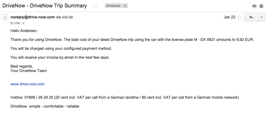
DriveNow sticks to a text only format in their transactional emails. While both the content and messaging are clear, the email doesn’t offer much more than the essential information. A logo and colors could be added to reflect the visual identity found on their website, and a photo related to the car rented on the trip could have been added to further enhance the experience.
2. Respond to inactivity
While growth is an important goal for most companies, retention is the key to long term success. Luckily, transactional emails can help! To help keep your users engaged and active, check in with users who have been inactive or haven’t opened or clicked an email in the past 6 months.
For example, a new user might have signed up but hasn’t started using his or her account. Or a user hasn’t been on your website in months. This doesn’t mean they’re no longer interested, they might just need a little nudge to remind them to use your product again. To turn inactivity around, embrace your transactional emails and give your users a good reason to come back.
Example
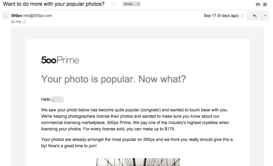
You can also respond to activity. Photo community 500px uses transactional emails to notify users about popular images and prompts the user to join their photography marketplace. The email also makes great use of personalization in adding a photo that the user has taken to the email, thereby applauding them for good work and then telling them how they can take it one step further.
3. Add incentives and call to actions
Call to actions (CTAs) are as essential to transactional emails as they are to landing pages. Why? Because emails are another opportunity for you to encourage users to take action somehow. They can help you drive traffic or attention to a certain marketing campaign and thereby support your other channels.For example, add a CTA to introduce users to a newly added feature, add social media buttons to encourage a follow to build your community or inform users about your current promotions to increase sales.
Regardless of the specific CTA you choose to use in your emails, remember to always be clear about what you’re offering and give users an incentive to take action.
Examples:
Fitbit
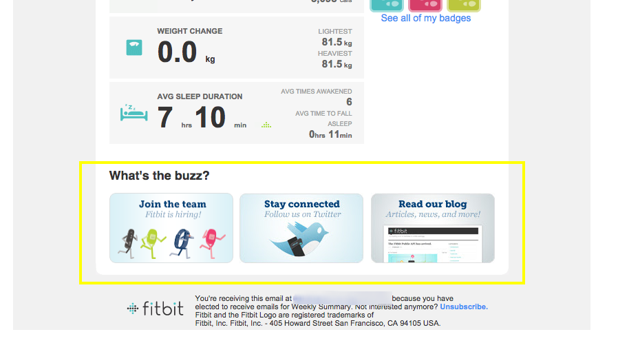
In their weekly activity recap email, Fitbit adds several call to actions to encourage users to engage with their community of users. This gives users several options to continue their activity with Fitbit and expand their relationship with the service.
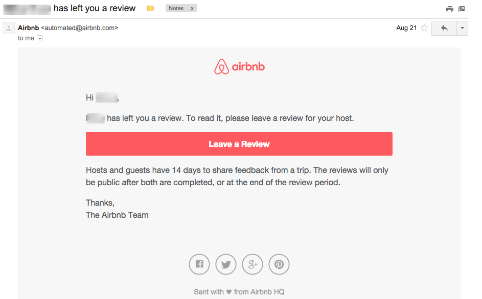
This email from Airbnb has a very clear call-to-action and adds an incentive for the user to leave a review in that the review of another user will be shown. Because Airbnb knows some users will inevitably skim through the text, they catch readers with a red button to make it easy to take action.
Transactional emails can be used as powerful bursts of water in your marketing squirt gun. Think of them not as single purpose messages but instead as multi-purpose channels that can boost your marketing efforts. So if you haven’t already, now is the time to start thinking about how you can make your emails work in your favor.
How are you optimizing your transactional emails? Share your experiences and thoughts in the comments below, we would love to hear them!


