Email best practices
Email design trends and best practices (2026)
Do you think that as a sender, designing an email is an art form far out of your reach? Well, then think again. Email design is all about being familiar with a few basic best practices and keeping current with the latest trends. While some concepts will require a more advanced level of design knowledge, most are at a level that any email marketer can grasp – especially if you have the right tools and resources.
We know that email design is very important for brands and marketers, so we dedicated an entire session to this subject at our Email Camp event. There, Mike Nelson of Really Good Emails shared cutting-edge email design trends that will drive more engagement. He also covered ways to solve readers’ problems and ensure accessibility across devices.
If you didn’t have a chance to attend this live presentation, don’t worry. In this article we will go over all the covered best practices, resources, and trends. By the end, you’ll be an email design expert.
Email design best practices for your campaign
But first, our talented Digital Design Director here at Sinch, François Sahli, weighs in with his email design best practices to keep top of mind. His advice applies for both beginners and more advanced users so, no matter whether you’re an email expert or still long for the days of AIM, you can be sure that his advice will help you out.
Formatting
To give your email a good look everywhere, keep in mind that emails are 600 pixels wide on a desktop and 320 pixels wide on a mobile phone. François suggests that :
While you can create emails in other widths, this can result in difficulties, such as making users scroll horizontally to see the entire message.
Additionally, think about optimizing the size of your images to ensure optimal quality on mobile phones. To compress images to reduce their size while maintaining the best quality, you can use tools such as Compress JPEG to get the best look possible. Easy, right?
Images
One of the elements that ISPs consider when deciding whether or not to allow an email to reach the inbox is the email’s text-to-image ratio. To avoid being marked as spam and having your messages blocked or filtered, it is recommended that you respect a ratio of about 70% text and 30% images inside your message. Keep it readable – remember, it’s an email, not a Facebook photo album.
You should also know that there’s a risk of your images being blocked by your contacts’ email clients. To anticipate this, Francois recommends inserting alt-text (a text that will be displayed if the image can’t be), and adding a background color in addition to any background images to make sure that the text will still be legible.
If you are looking for images for your emails, you can browse Unsplash and Pixabay, two online image banks that offer beautiful photos for free. Additionally, if you need help with creating easy and free email designs, Canva is the tool for you.

Calls-to-action
A call-to-action (CTA) is a button that prompts the reader to perform a specific action, such as registering for a webinar or purchasing a product. To maximize your chances of conversion – meaning actions and sales from users – François recommends:
Limit the number of CTAs, especially above the fold, which is the line that delineates what the user sees without having to scroll. You can also play with the color and contrast of the call-to-action buttons to make them stand out and easy to see.
Additionally, pay attention to the size and spacing of clickable buttons and icons, especially on mobile phones. You should make them at least 40 to 48 pixels wide. Bear in mind that the smaller the clickable elements are, the further apart they should be so that users don’t click on the wrong element.
Typography
There are two types of fonts: web safe fonts and web fonts.
Web safe fonts are fonts like Arial, Times New Roman, Verdana or Georgia. These are the default fonts found on most operating systems and devices and are supported by all major email clients. Conversely, web fonts are not among the fonts available by default. Some of the best-known web fonts are Open Sans and Roboto.
While web fonts offer many design opportunities, specialists must be careful because, unfortunately, not all email clients support them.
That is why, when using web fonts, you must set up a list of back-up fonts called fallback fonts. This way, if an email client can’t comply with your first choice, they will choose the next font on your list so that the email display is still close to your original.

Code
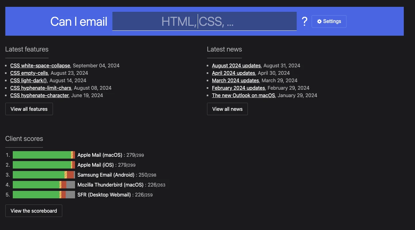
Some common web features and code elements are not always well-supported by certain email clients. For example, Gmail may have trouble displaying web fonts, some versions of Outlook may not always display background images correctly, and many webmail providers have trouble displaying drop shadow features. This is why you should make sure that the various elements of your emails are supported by the different email systems.
Can I Email, which lists many emails clients’ partial or total support for many HTML and CSS features. This way, you can take into account all the design possibilities when designing your emails.
Responsive design
Responsive design is a design technique that automatically adjusts how an email is displayed in any email client. Designing an email using responsive design is essential, given that most users nowadays read their emails on mobile phones. In fact, 80% of email recipients suggested they would delete an email that didn’t display correctly on a mobile.
Therefore, when designing your emails, make sure you use an email editor that uses responsive design by default, such as Email Editor from Sinch Mailjet. To take it one step further, Email Editor even offers a preview feature to help you check how your email is shown in different inboxes, for multiple device makers, versions, devices and countries. No more guessing….
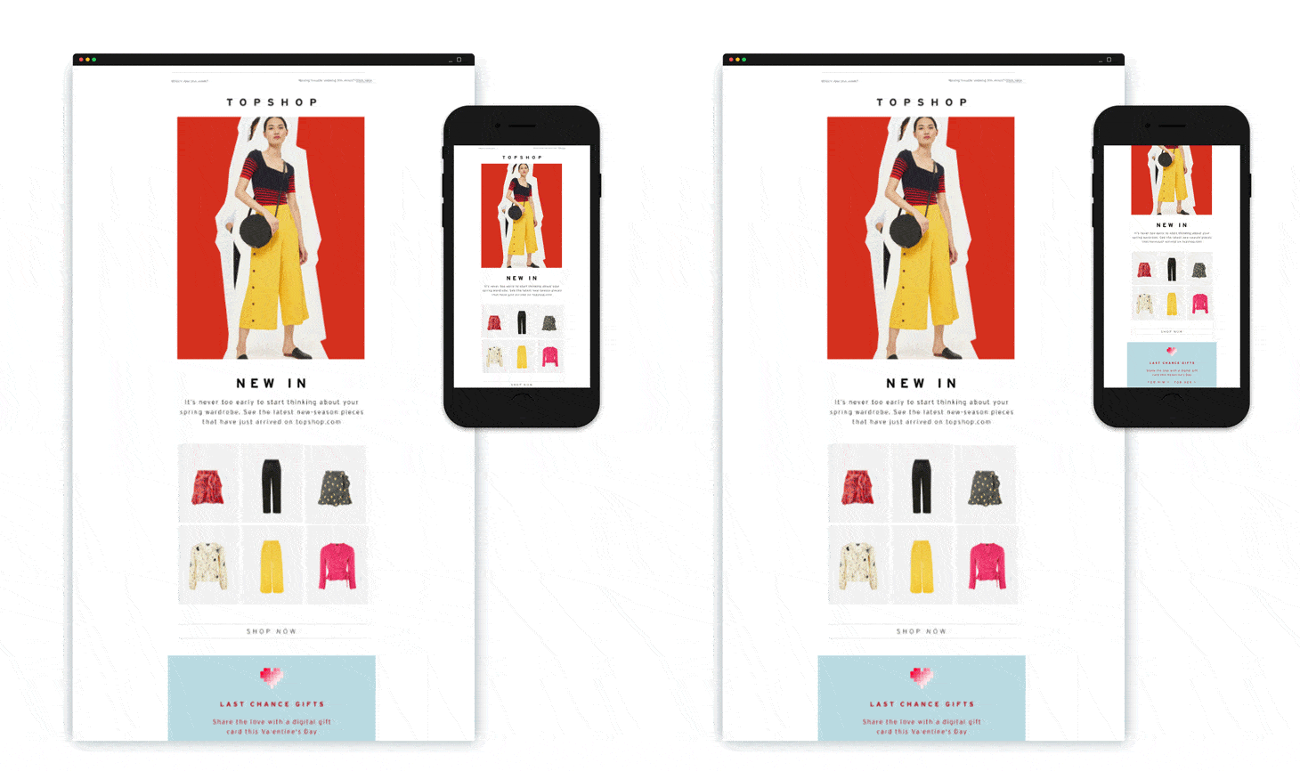
An example of a responsive email design that scales and adapts to a reader’s mobile screen
Templates and components
Templates and libraries see heavy use in web page design. However, it’s also very useful to create a library of components for your email campaigns. Once you have created your library, you can create all your emails with it to ensure that they respect your design guidelines.
This will also allow you to test your entire library to guarantee that any email created from it is displayed correctly. Another benefit of a library is helping you to test different layouts more quickly, either when creating new emails or performing A/B tests on existing emails.
If you need ideas, Really Good Emails and Email Love are two very well-designed email sites. They provide an endless source of inspiration to help you design beautiful emails.
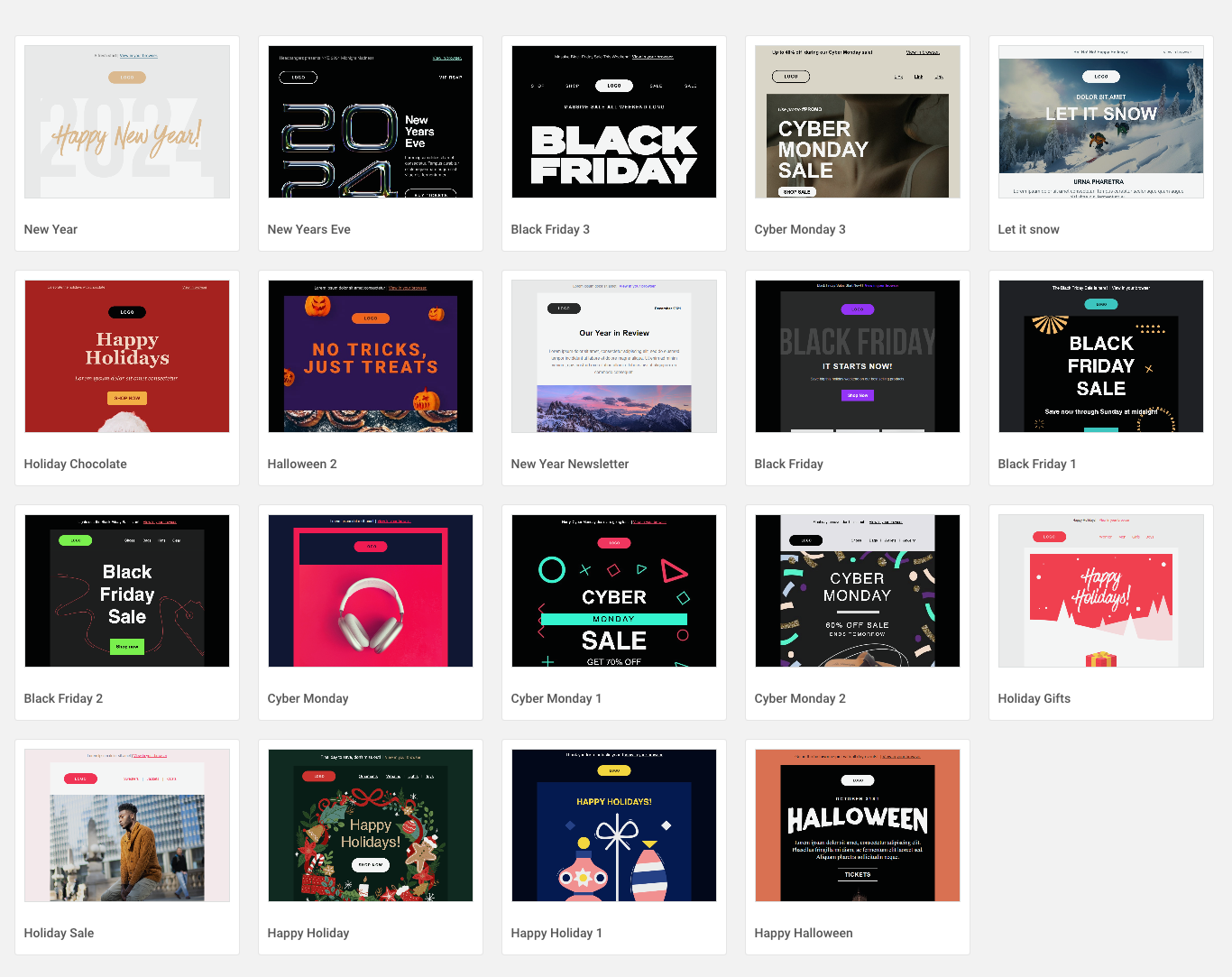
Sinch Mailjet has many pre-designed and stored newsletter templates for you to try out, such as these holiday email templates.
Email design trends
Now that you know the basic email design best practices, it’s time to switch over to trends, and see what’ hot (and what’s not) rolling into 2026. Here are a few that Mike covered in his Email Camp session, Cutting-edge email designs.
Go big, or go home
A new trend that Mike and the team at Really Good Emails is that brands are really pushing hard to stand out from the crowd. And one tactic they’re using is to focus the email around the brand. Not the product, not necessarily the message, but the brand.
Interestingly, many companies are deciding against using their logo, icon, or event trademark to stand out, but rather big bold texts, headlines, and images. Here are a couple of examples:
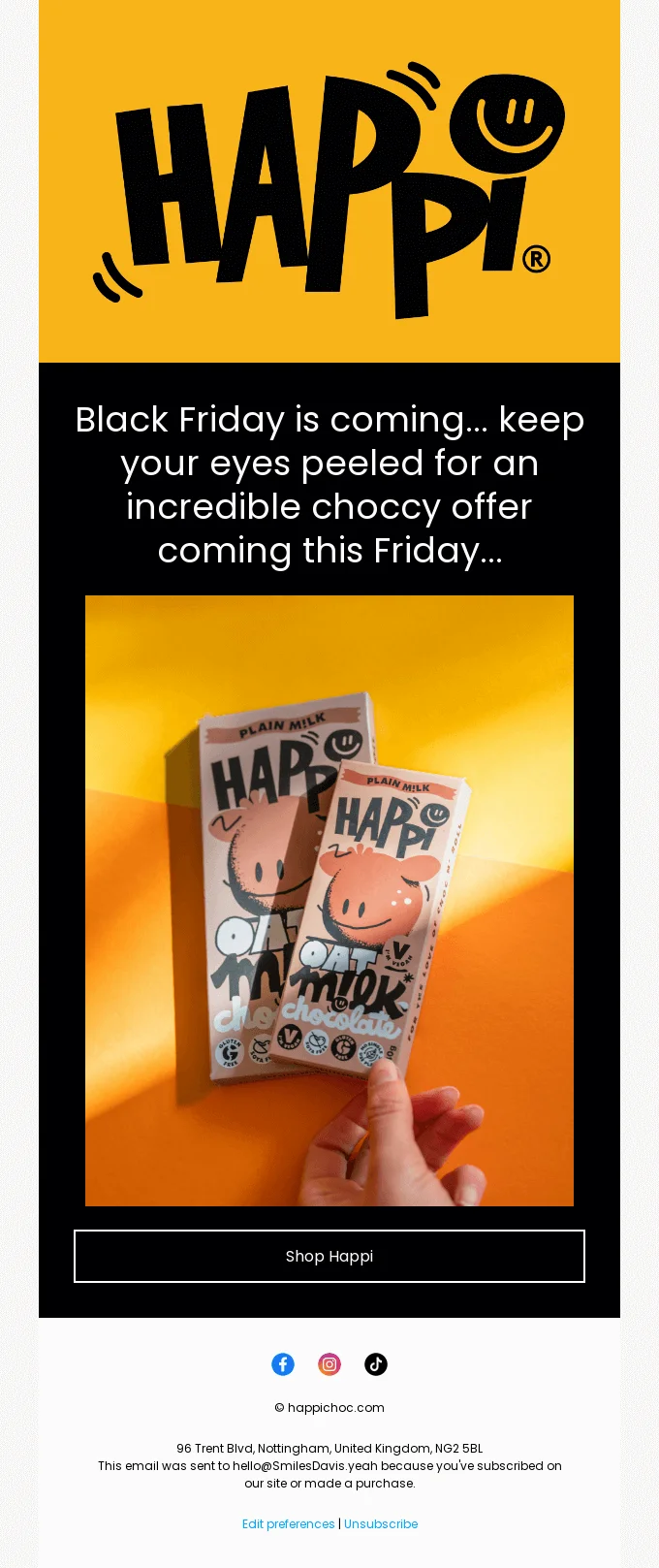
Notice how the team at Happi use the header image to really draw attention to their brand

The same with The Label Edition, as their title draws recipients into the email
Why is it catching on?
It’s become increasingly difficult for brands to stand out as more and more competitors enter the marketplace. So, they’re deciding to be a bit different, a bit quirky. By deviating a little from the typical email design structure, brands are hedging their bets that people will be drawn in and engage with the content.
Hard tables
No, we’re not talking about difficult mental arithmetic. Hard tables in this case refers to brands outlining their content blocks with marked, black lines. The outlines don’t have to be black of course, if you’re sending emails in dark mode then a white hard table can be used:

This example from Arkk shows the same concept being used on a dark background

Whereas this example from XXXI is an example of a hard table on a standard white background
Why is this catching on?
Applying a hard table email designed provides structured clarity to a newsletter. By enclosing content within these tables, readers can visually identify related content blocks making the newsletter appear more organized and easier to go through. This is particularly helpful for newsletters with multiple sections or a large amount of content.
Celeb cameos
This one doesn’t need too much of an explanation – celebrities have been used to market products for over a century now. In fact, since West End actress Lily Langtree appeared on posters for Pears Soap way back in 1882. Seems like this email design trend is having somewhat of a resurgence.
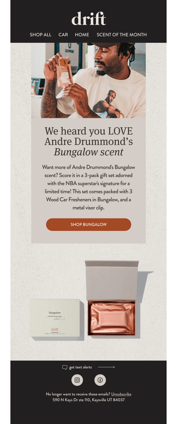
As you can see, Drift employed the services of Andre Drummond to be the face of their email campaign
Why is this catching on?
Having a celebrity be the face of your newsletter campaign adds immediate street credibilityand can enhance a brand’s reputation. If the celebrity is popular with your audience and shares your email on social media, it can go viral, reaching a much wider audience than your typical subscriber base.
Picture wall
So, imagine you’ve just finished a product shoot. The photographer has absolutely nailed it and you’re now the proud owner of 100+ high-quality product images. The only downside is…you now must pick between them. Which ones will make the cut? Which ones will star in your upcoming newsletter? So many tough choices to make, right? Well, maybe not…

Or you could just remove the guesswork and use a bunch of images in a picture wall

Sometimes the images are just too good to be sat in the cloud, right?
Why is this catching on?
Apart from the fact email marketers can’t decide which images to use in their campaigns? No, jokes aside, using a variety of images can help show products from different angles. For example, if it’s an item of clothing, what it looks like worn by people of different people with body types, height, gender, etc. This will better help potential customers picture themselves using the product.
Raw and unfiltered
For those of you reading this from the UK, you might remember the famous John Smith’s No nonsense advertising campaign by English copywriter and Creative Director John Webster. It appears this trend has found its way into email design, as more brands include unedited images and video footage in their newsletter campaigns.

Patagonia open their newsletter campaign with an unedited photo of a dog in the back of a camper van

GiftShop’s collaboration with Parisian restaurant dumbo uses a slide of raw, unedited images from the kitchen to market their new t-shirt line.
Why is this catching on?
With AI dominating almost every industry conversation (especially AI email marketing) people are becoming a little weary. Everything seems to be artificially created or adapted these days, leading to a sort of counter-culture movement within email design. A lot of brands are reverting back to authentic, original designs and photos within their campaigns.
Remember the environment and accessibility
Email ecology and accessibility are becoming increasingly important in the lives of brands and users and will be at the heart of future email design strategies. Design will have to take into account more ethical and environmentally-friendly criteria.
When we talk about email and environment, there are really two points where we can have a positive influence: data storage and display.
There are several simple ways to reduce your email carbon footprint:
- Reduce image sizes
- Reduce the complexity of the email to reduce the size of the HTML code
- Think about how “dark mode” can impact your email design
- Think about the brightness of your designs
- Include a message asking the user to delete the email after reading it
In terms of accessibility, more than 1.3 billion people live with some degree of visual impairment. Your goal is to help these people read emails as easily as possible. This joins another current trend, which is voice assistants that are progressively beginning to read messages. To allow these tools to work, you have to take into account certain practices:
- Structure the message
- Prioritize content
- Use contrasting colors
- Optimize HTML code
How Sinch Mailjet can help you
Mailjet’s email marketing solution allows you to easily create beautiful designs for your emails. Thanks to an intuitive drag-and-drop email builder, you can design 100% responsive email campaigns that show perfectly on any screen in just a few clicks. Try it for yourself.
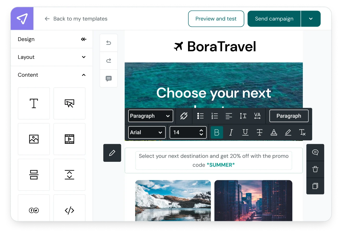
Mailjet’s email template gallery will save you time when creating your campaigns, so you can focus on optimizing your emails’ performance. Mailjet also offers many advanced features such as email segmentation, personalization and A/B testing.

