Email best practices
Transactional emails don’t have to be boring
We all know how transactional emails can look bad or be quite boring. Of course, it is important to know that your payment has been processed or that this new pair of jeans you just can’t wait for has been shipped. But almost everytime, those messages, as important and awaited might they be, are bland and off-brand. Usually, the companies using transactional emails will simply send the relevant information (invoice, confirmation, receipt, password reset…) the simplest way possible (i.e. text only).
We’ve analyzed a few creative transactional emails, to show you that they don’t have to be boring and you can even leverage them as part of your marketing strategy to a new revenue channel through upselling.
Keep it looking good
The first thing companies can easily implement in their transactional email strategy is the creation of messages that not only are relevant and interesting, but also look good. It’s the easiest thing to do regarding transactional emails: no complicated code to create or database to link to your SMTP relays. All you need is a good design and somebody able to integrate it into your emails.
A well designed transactional email will obviously be more impactful. A proper structure – rather than just an all text-based email, which will look like a supermarket receipt – will help the recipient to identify more quickly with information he or she’s looking for. This better UX will leave a better image of your brand.
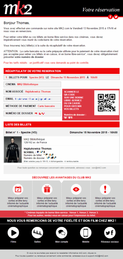
Our example is a purchase confirmation email by MK2, a French theater chain. Immediately, you can identify all the information you need: location of the theater, selected movie, file ID (to get the actual ticket) and, of course, purchase information. If you set aside the contextual information (movie information and QR code), you’ll still have a readable email, properly designed, using the visual identity of the brand. That’s something that your customers will thank you for.
Use the data you already have
As you can see in the example above, the company integrated data that the user entered to process the ticket payment. It’s a clever way to remind the recipient of what he or she purchased, besides the information he or she was waiting for (here, a confirmation).
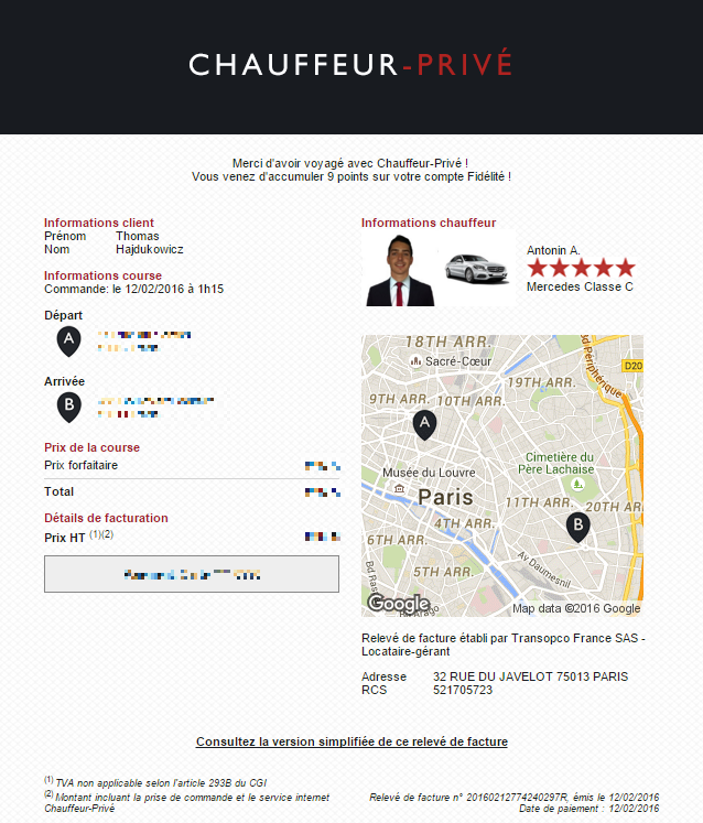
Since you already have the data you need, don’t hesitate to add it to your transactional email. This additional value is a nice touch to what would be otherwise a weak message. Here, the Taxi app Chauffeur Privé not only sends you a receipt for the journey you just accomplished, but also a summary of said journey, and the time and date the driver picked you up. All useful information to the user, especially for record keeping or looking back to where you were the night before, if you had more than a couple to drink.
Go one step further
As we saw with previous examples, transactional emails are a good way to grant your users a better UX, and spread your brand recognition. But it can also be a wonderful marketing tool. As you may know, transactional emails have open and click rates 4 to 8 time higher than marketing emails.
Obviously, it’s a golden opportunity to insert a promotional message to these highly asked (and checked) emails. Be careful: the email that will leave your servers is a transactional email and has to look like one. Don’t waste this opportunity being too pushy. Your promotional content has to be efficient yet discreet enough not to be invasive.
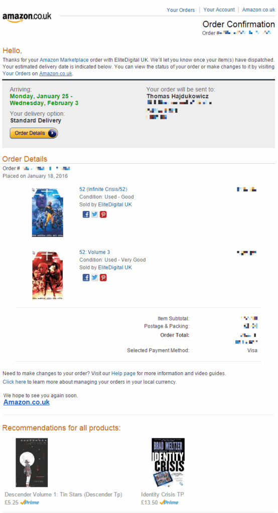
An historical player in this method of emailing is Amazon. The marketplace makes a great use of the purchase and invoice messages it sends to add intelligent marketing touches, with products that might interest you (either because they relate to what you just purchased or because you check for them in the past).
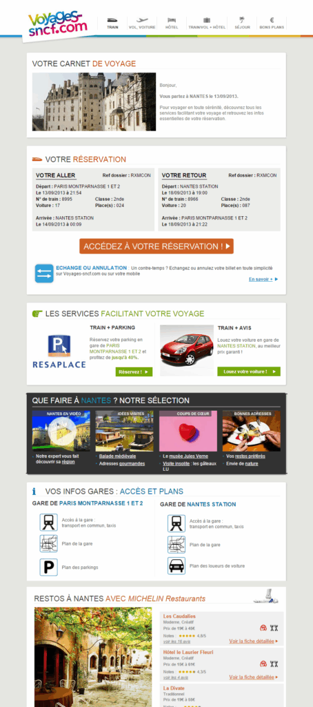
With the same idea, SNCF, the French railway company, offers its customers multiple services after they booked a ticket. Here is a recap email sent after booking a journey. The core of the email is of course the summary of the ride. But if you scroll down the message, you’ll see multiple services directly linked to your arrival. Services like car rental on location, recommended restaurants in the region or activities to do. As a company specialized in passenger transport, these information are highly valuable for their customers.
A glimpse of the future
Finally, let’s project ourself to the future. With the ‘Internet Of Things’ on the rise, transactional email might have a new place to shine. The whole idea of connected devices is for them to exchange data online with you. For notifications, email seems to be the best tool, since everybody has an email address and chances are likely that, as the owner of connected devices, you are also the owner of a smartphone (where you’ll receive and read the notifications sent by the devices).
Here, Fitbit, the company famous for its wearable technology, ping the owner with an email when the battery of his/hers Fitbit Flex is low, along with an “How-to” charge it. Not only the user will put the device to charge. So simple, but so effective! Also, Fitbit provides a clear unsubscribe link, in the case the user doesn’t want to be bothered by these specific notifications anymore.

Key takeaways
Boring transactional emails are not inevitable. All you need is a little creativity. For the rest, tools like Passport for Transactional can help you make more of these messages. Say goodbye to bland receipt, and step your transactional email game to add-value and create new revenue channels!

