Email best practices
How to scale and optimize your email design system
A design system can revolutionize your team’s workflow, ensuring every sent email aligns seamlessly with your brand. But how do you ensure this is scalable as your team and organization grows?

PUBLISHED ON
Scaling your email production isn’t just about speeding things up; it’s also about making sure that every message looks and feels like it’s coming from the same brand, every single time. This can be challenging, especially for fast-growing small to medium-sized businesses.
So, if you’re spending hours meticulously piecing together emails, then a scalable design system might just be the answer to saving you time and ensuring consistency across the board. If this is the first time you’ve come across the term, not to worry – you’re definitely not alone!
The good news is senior email developer and designer at Hims and Hers, Julia Papanek, shared some invaluable tips for streamlining your process while maintaining brand voice in her Email Camp 2024 session, Scaling your email design system for inbox domination. And the even better news is we’ve pulled out the key points from the session and summarized them for you in this post.
Table of contents
Foundations
Modules
Templates
#1 Implementing character counts
#2 Create dynamic modules
#3 Transactional vs. marketing emails
#4 Establish a roadmap for a refresh
What is an email design system?
First off, let’s start by defining exactly what a design system is.
A design system is essentially a toolkit for email marketers, giving them a set of pre-made building blocks—like logos, colors, fonts, and layouts—that make creating emails fast and easy. Instead of designing each email from scratch, you can just plug in these pieces ensuring every email looks on-brand, consistent, and professional.
This saves a ton of time, reduces mistakes, and helps make emails more effective as customers begin to recognize and trust this familiar style. While many companies have robust brand guidelines, translating those into email-specific components requires an adaptable approach. Hence, the email design system.
“A design system is a set of building blocks and standards that create a unified framework and help maintain consistency across the email marketing team.”
Julia Papanek, Senior Email Developer and Designer at Hims and Hers
Let’s go through and take a closer look at some of the specific elements you might find in an email design system.
Foundations
The foundational elements that you’ll find in every email design system include:
Logo
Grid
Typography
Color
Iconography
They are referred to as foundational elements because they create a unified, recognizable look for your brand across all emails. The logo immediately tells the reader who the email is from, while the grid organizes the layout so content is clear and easy to read.
Typography (font style and size) again reinforces brand identity and ensures the text is readable, and consistent color choices make the design feel cohesive and on-brand. Together, these elements ensure each email feels familiar to readers, while maintaining a polished and consistent look.

Notice how the typography, colors, and logo all work to build Sinch Mailjet’s brand identity
Modules
Now, onto the more email-specific elements. Modules, or, commonly referred to as a module library, are like a collection of little building blocks or Lego bricks (remember those?) that can be plugged and played to build a variety of different emails. They typically include:
Headers
Footers
Heroes
Secondary
Spacers

They are all essential building blocks for almost any email design system because they help structure and organize the content, making it easy to read and visually appealing.
Headers usually include the brand logo or navigation links, setting a familiar tone for readers. Footers wrap up the email with important information such as a contact email info or perhaps more importantly – an unsubscribe link.
The hero section is the main visual area, often featuring a headline or image to grab a reader’s attention right away. Secondary sections allow for additional content, like product details or related information, while spacers create breathing room between sections.
If you’re looking for an easy-to-follow yet detailed, more technical guide on how to set up and build an email design system from scratch, check out the guide the folks at Email on Acid put together. It runs through how to review your existing content, define the key modular components, and bring it all together under one roof.
Templates
Now, once you’ve worked through defining your foundational elements and decided on the building blocks you’ll use to structure and organize your content, you can think about creating pre-set templates. This is where the ball really starts to get rolling.
Rather than starting from scratch, you and your team can simply add content and make small adjustments to pre-defined templates, significantly speeding up campaign creation. What’s more, because the foundational elements have already been built into the templates, brand consistency is assured every time an email is sent from your organization, helping build trust with your audience.
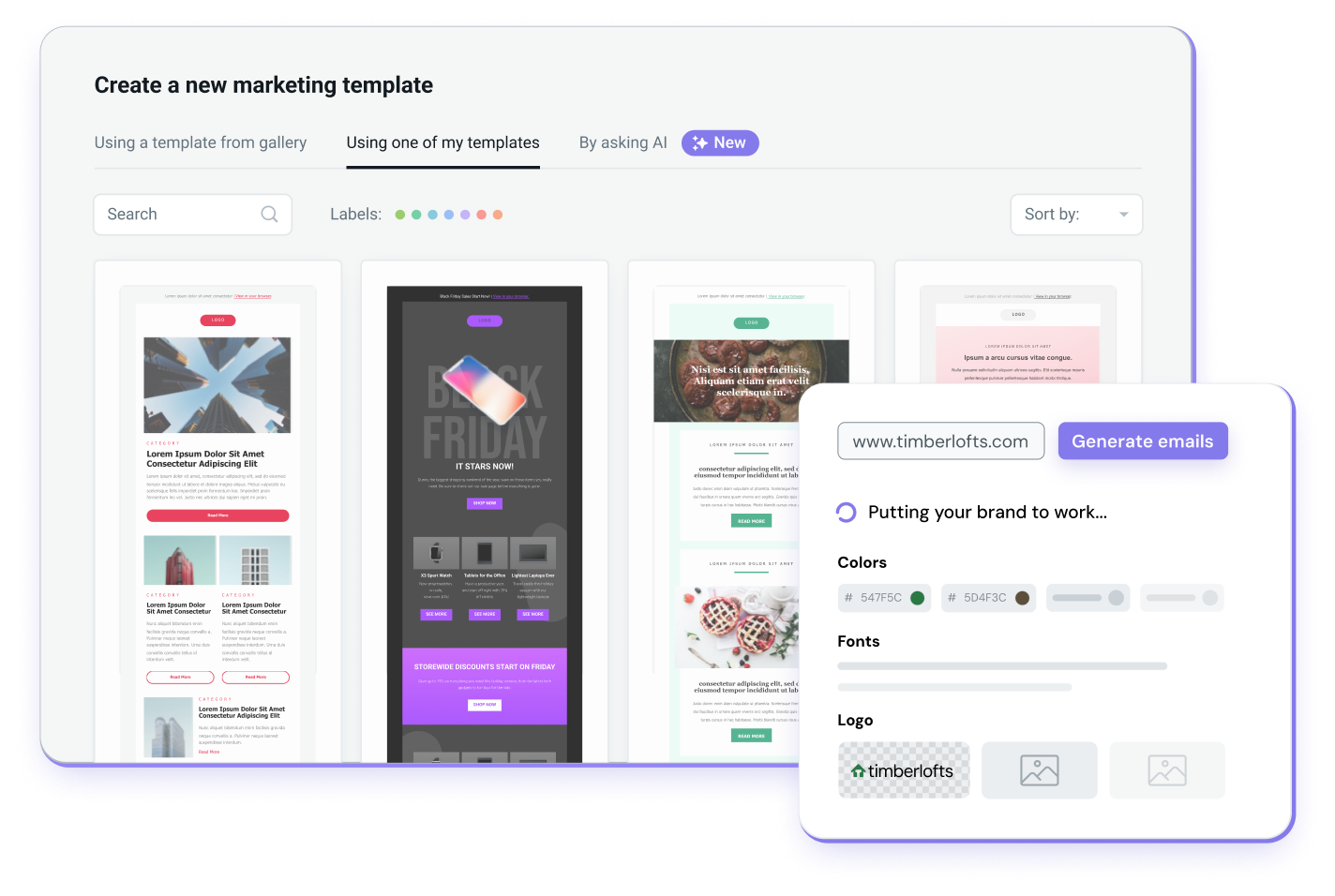
With Mailjet’s Email Editor, you can easily create beautiful responsive templates in just a few clicks. Add or edit content, images or calls-to-action by simply by dragging and dropping in key elements.
4 tips for email marketers to improve their design system
So, now that we’ve established what a design system is and some of the key elements it should include, let’s run through some of the tips and insights Julia covered in her Email Camp 2024 session.
#1 Implementing character counts
The first recommendation Julia makes is to cap off your emails with a character limit. So, what does this mean in practice? Well, you’ve probably come across an email or two in where an over-zealous marketer got a little heavy on the copy, right? Let’s face it, we all have. But as a recent study showed, people spend 9 seconds on average when browsing an email. This makes short, scannable copy an increasingly important element in marketing emails.
To ensure this consistency throughout your campaigns, include a maximum character count in your module library and pre-made templates. That way, when your team’s over-zealous copy connoisseur steps up to write an email, their pens are tied to your design system’s standards.
If you’re having difficulty getting buy-in from across the team, Julia recommends setting the following max character limits:
Hero headline: 38
Hero body: 68
Secondary headline: 15
Secondary subhead: 26
Secondary body: 137
CTA: 17
#2 Create dynamic modules
Right, so a little heads up before we get started with tip #2 – but this one’s going to get a little bit more technical. And it’s to do with creating dynamic modules (the building blocks of our email design system).
So, one common problem email marketers can run into when building out their email design system is to end up with multiple versions of the same basic module (like a hero image section) that vary only slightly. For example, you might have a hero module with a button in some emails, without a button in others, or with a light background for one campaign and a dark background for another.
Over time, managing all these small variations separately can get overwhelming, making your library cluttered and harder to use. Building out this email design system was supposed to make things easier, right?
Now, dynamic modules solve this problem by allowing you to use one flexible “master” module with customizable options. Instead of creating multiple versions of a module, you can set it up to adapt as needed. Using tools like Figma, you can add “variables” (like light vs. dark mode) and “Boolean properties” (options that turn specific features on or off, like buttons or images) to create dynamic elements within one module.
This setup means that a single module can cover all your needs by simply toggling these options – saving space in your module library and speeding up the design process.
Email design trends and best practices are constantly evolving as marketers get their hands on ever more advanced tools. So, what does this mean for 2025? Here’s what the experts have to say.
#3 Transactional vs. marketing emails
The third tip Julia discussed in her Email Camp session was the need to set a distinct visual style for both transactional and marketing (promotional) emails. Why? As it helps set clear expectations for recipients.
Transactional emails, such as order confirmations or account notifications, often need immediate attention from customers. Making these emails visually different from marketing emails helps them stand out in the inbox and signals that they’re importance. For example, a transactional email might use a more straightforward design with neutral colors (like black, white, or gray) to convey a more direct, serious message tone, while your marketing emails might be more colorful and visually engaging to attract interest in promotions or offers.

Some of the different types of transactional versus marketing emails you might be expected to send
Differentiating these styles in your design system not only drives engagement, but also aids in maintaining consistency across campaigns.
#4 Establish a roadmap for a refresh
Over time, your design system will need periodic updates to stay fresh, relevant, and aligned with evolving brand needs. Without a regular refresh plan, your email templates and modules can start to feel outdated, which may lead to lower engagement and less interest from your audience.
So, by planning a sort of “relook” in advance you avoid the sudden scramble of trying to update everything at once. Also, when you have a planned schedule, your team knows exactly when updates will happen, making the whole process a lot smoother.
You should also try bringing in members from different teams across the company. You’ll often find different perspectives and ideas are brought to the table, elements you may not have considered had you kept the discussion between, say, design and marketing. This process keeps your emails visually interesting, better aligned with your current brand goals, and adaptable to new trends or customer preferences.
You can watch Julia’s Email Camp 2024 session, with a bonus Q&A session at the end
How Sinch Mailjet can help you
Mailjet’s email marketing solution allows you to easily create beautiful designs for your emails. If you’re using a design tool that supports HTML export, like Figma or Adobe XD, you can export your email templates in HTML format using Mailjet’s advanced editor.
Or alternatively, you can try Mailjet’s intuitive drag-and-drop editor to easily assemble modular blocks, based on your design system, to produce 100% responsive email campaigns, that show perfectly on any screen, on any device.


